
How to Stop Irritating Website Visitors: 5 Tips to Try on Your Next Web Revamp
We know all too well how an unenjoyable browsing experience makes us bounce right out of a website. Let’s stop irritating website visitors on your company site with these tips. Do you patiently wait…
We know all too well how an unenjoyable browsing experience makes us bounce right out of a website. Let’s stop irritating website visitors on your company site with these tips.
Do you patiently wait for a website to load or would you rather do something else? What are your thoughts about huge pop-up banners? And what about persistently hovering chatbots?
They might be personal, but these are a few of the things that our team at Chykalophia doesn’t enjoy when visiting a website. Coming from this, our CEO & Head of Strategy, Ari Krzyzek, did a simple poll on LinkedIn a little while ago to find out what people find most annoying about a website.
Read on to take a look at the poll result and our proven recommendations you can try to stop irritating website visitors on your company site.
What people hate about your website
Our LinkedIn poll, which you can see below, revealed several things that irritate website visitors the most:
- Annoying newsletter pop-up
- Takes forever to load
- Confusing navigation
- Lack of information
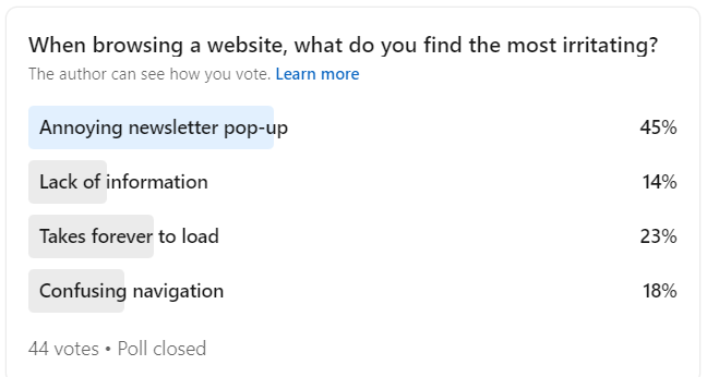
Poll result from Ari Krzyzek's LinkedIn
What are the most common problems in a website?
Apart from our poll result, there are other researches that show other things that people dislike about a website. Here are some of them:
- Not mobile optimized
- Autoplay video or sound
- Keyword-stuffed content
- Unrealistic, too-theatrical stock images
- Flashing animations
People don't leave because your site lacks features. They leave because it wastes their time.
5 recommendations to stop irritating website visitors
Now that you have seen the most common things that drive people away from your site, let’s see what you can do to avoid them.
Reduce the pop-ups
Does your website have a pop-up that covers the whole screen, with a teeny-tiny X button?
Remove it.
Replace this with a smaller pop-up that you can close by clicking anywhere outside the box, with relevant, updated content. And don’t rush. Let people scroll around for a bit, so they know what solution or content you offer, before having anything pop up on their screen.
How to do it
- Watch 10 to 15 session recordings in Microsoft Clarity and note where visitors hunt for or rage-click the close button.
- Kill any popup that fires before the page finishes loading or before roughly 30 seconds of reading.
- Rebuild the survivor as a small slide-in that closes on any outside click, triggered by scroll depth or exit intent.
- Check it against the Nielsen Norman Group popup guidance to confirm your timing and dismissal are not on the flagged list.
See a worked example
As an illustration, a SaaS marketing site might swap a full-screen newsletter modal that fires the instant the page loads for a small slide-in that only appears once a visitor has scrolled about 60% down a blog post. In our experience, delaying and shrinking the ask tends to soften the "close it and leave" reaction, though the real effect depends on your traffic and offer.
Tools to use
Nielsen Norman Group on popups for the intrusive patterns to avoid, and Microsoft Clarity to watch how real visitors react to your current popup.
Steal our AI prompt
Here is the copy and trigger settings for the popup currently on my homepage: [paste]. Acting as a UX conversion reviewer, tell me whether its timing, size, and close behavior match the patterns Nielsen Norman Group flags as intrusive, then rewrite it as a less disruptive slide-in. My visitor is [describe who they are] and the one action I want is [describe the action].
Speed up your site loading time
Did you know that slowing a mobile page from 1 second to 10 seconds can raise the chance a visitor bounces by up to 123% (Google/SOASTA research)?
Slower mobile load, higher chance visitors bounce
In the age where attention span is short and time is money, it’s extremely important that your website can load fast. And you can improve your page speed by:
- Compressing your images
- Reducing the number of redirects
- Enabling cache with premium plugins like WP Rocket, or free ones like W3 Total Cache and WP Super Cache
- Removing any autoplay multimedia
- Keeping the animation to a minimum amount
How to do it
- Run your top pages through PageSpeed Insights and write down the Largest Contentful Paint and the top "Opportunities".
- Compress and convert oversized images to WebP with TinyPNG before re-uploading them.
- Enable page caching and asset minification with WP Rocket, or your host's built-in cache.
- Re-run PageSpeed Insights and confirm the LCP number actually moved, not just the headline score.
See a worked example
For example, a WordPress marketing site carrying a few uncompressed hero images and a stack of plugins might sit around a 6 to 8 second load on mobile. Compressing those images and turning on page caching often pulls Largest Contentful Paint down by a second or two, though the exact gain depends on your hosting and theme.
Tools to use
PageSpeed Insights to measure Core Web Vitals and get prioritized fixes, TinyPNG to compress images to WebP, and WP Rocket for page caching and minification in one plugin.
Steal our AI prompt
Here is my PageSpeed Insights report: [paste]. Acting as a web performance engineer, rank the "Opportunities" and "Diagnostics" by likely impact on Largest Contentful Paint for my stack, which is [describe your stack, e.g. WordPress + Elementor on shared hosting], and give me the three fixes to do first with the specific setting to change for each.
Be straightforward
Your catchy copy and fancy words might sound good on paper, but not to your visitors.
If you can simply say “long”, avoid saying "sesquipedalian”. This is an exaggerated example, but you get the point 😉
And don’t stuff as many keywords and keyphrases as you can for the sake of SEO. This is irritating website visitors and can drive them to exit your site quickly, which can hurt your SEO instead.
How to do it
- Paste each key page's copy into the Hemingway Editor and aim for roughly a grade 8 to 9 reading level or lower.
- Replace every "very hard to read" sentence and strip passive voice and filler adverbs.
- Cross-check tone and structure against a plain-language writing guide.
- Read it out loud; if you would not say it to a client's face, cut it.
See a worked example
As an example, a line like "We leverage synergistic, best-in-class methodologies to optimize outcomes" says almost nothing a reader can picture. "We help your team ship faster" carries the same promise in words people actually use. Cutting jargon and reading level tends to make copy easier to skim, especially on a phone.
Tools to use
Hemingway Editor to flag hard-to-read sentences and score reading level, and Digital.gov's plain-language guides for writing content people actually understand.
Steal our AI prompt
Here is a section of my website copy: [paste]. Rewrite it in plain, concrete language at about an 8th-grade reading level, remove jargon and keyword stuffing, and keep it to the point. Preserve the meaning and this brand voice: [describe your tone, e.g. warm, direct, no hype].
Only show the most relevant content
If your customers don’t need to know your supply chain process, don’t display it on your website. Just let them know that you pick ethical suppliers that comply with the environmental, social, and governance (ESG) requirements to show that you’re playing a part in supporting sustainability, for example.
To be relevant and informative without being too annoyingly “chatty”, you should manage your information architecture to show:
- What your business is about
- Clear product or service descriptions
- What makes you different
- Why people should buy from you
- Why people should trust you
How to do it
- List every page and section, then map each to a buyer question it answers (what you do, why you, why trust you); flag anything that answers none.
- Run a tree test or card sort in Optimal Workshop to see whether people can find your core pages by label alone.
- Watch Microsoft Clarity scroll heatmaps to find sections nobody reaches, then cut or demote them.
- Keep only content that answers a buyer question and move internal detail to a secondary page or remove it.
See a worked example
For instance, a services firm might have "Our Process," "Methodology," and "How We Work" in its nav, all pointing at overlapping content. A quick tree test usually shows visitors cannot predict which link holds what they want, which is a signal to merge them into one clearly labeled path rather than three.
Tools to use
Optimal Workshop to card-sort and tree-test your navigation, and Microsoft Clarity to see which sections visitors actually reach.
Steal our AI prompt
Here is my current site navigation and a one-line description of each page: [paste]. Acting as an information architect, tell me which items overlap or answer no real visitor question, and propose a leaner navigation grouped by what a [describe your ideal buyer] actually needs in order to decide.
Be repetitive but not redundant
The rule of seven says a customer needs to come across a message at least seven times before it seeps through. This means that you need to repeatedly communicate your brand message across your website.
However, find different ways to do it so people don’t find your content boring. For example, display one message on your hero banner, on a section on the homepage, and on a dedicated landing page, delivering each on in different wording.
How to do it
- Write one core message first, using a framework like StoryBrand's one-liner or the Value Proposition Canvas, so it is sharp before you repeat it.
- List every high-traffic touchpoint (hero, homepage sections, a key landing page, the footer) and assign the message a different angle on each.
- Rewrite each instance so the wording differs but the promise is identical; never paste the same sentence twice.
- Re-read the journey top to bottom to confirm the thread feels consistent, not redundant.
See a worked example
As an illustration, a single value proposition like "design that turns visitors into customers" can run as a hero headline, get reframed as "we design for conversion, not just looks" on a services page, and appear again as a caption under a client result. Same idea, three angles, so it lands without reading like copy-paste.
Tools to use
StoryBrand to distill one repeatable one-liner, and the Value Proposition Canvas to pin down the exact promise you repeat across the site.
Steal our AI prompt
Here is my core brand message and value proposition: [paste]. Give me five different phrasings of the same promise, one each for a hero headline, a homepage section, a services page, a case-study caption, and the footer, so it repeats across the site without sounding copy-pasted. My audience is [describe your ideal customer].
Are you guilty of irritating website visitors on your company site?
If the answer is yes, let’s change it now!
You can bookmark this page for your future reference when the time comes for you to revamp your website, or bring in our UX and web design team to do it with you.
Keep reading
 UX & Web Design
Top 5 Things to Improve User Experience on Your Website
A good store makes visitors feel comfortable and happy to spend more than a few more minutes browsing. A good website should be able to do that, too, and you can have that if you improve user…
- UX & Web Design
The Checkout Is Where Your Ecommerce Revenue Leaks Out
Seven in ten carts never convert, and most of that loss is self-inflicted at checkout. Here is what the data says is leaking, and the fixes that earn the order back.
- UX & Web Design
Web Accessibility Is a UX and Revenue Problem, Not Just a Legal One
Almost every website fails basic accessibility, and the defects that lock out disabled users are the same ones quietly costing you conversions and search visibility. Here is the data, and what to do.
See exactly where your site is losing conversions
Paste your URL and get an instant conversion score. No form to fill out, no sales call.
Weekly strategies for businesses building what's next.
The Next Draft: one email a week on turning B2B websites into pipeline. No fluff, unsubscribe anytime.